Open Font License
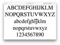
According to the open-source font editor FontForge, “A font is still a font even if it has only one glyph in it.” I often wonder if this statement can be adjusted this way: “A font is a new font even if only one of its glyphs has been changed.” I recall reading once—can’t remember where—of a literary thought experiment that asks whether one can produce a new novel by changing one or a few words of, say, Moby Dick. Laurel Schwulst’s Times Dot, a version of Times New Roman whose “i” and “j” dots have been enlarged by 190%, suggests that the answer is yes.
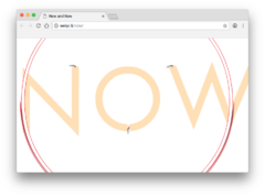
Most of today’s font editors rely on outline formats that precisely describe the outside and inside, or counter and letterform, of a letter’s shape, like TrueType or Postscript Type. A TrueType font, as an example, will maintain a proportional constant between stroke size and point size. With BIG AND USELESS, Weiyi Li proposes an alternative: a typeface whose “strokes will always remain the same weight, even when they are [typeset] in different font sizes, much like drawing several letters in different sizes with a sharp pencil.” Alongside BIG AND USELESS, Li produced a website titled NOW, which houses a flash animation demonstrating how a font may simultaneously have a changing point size and a fixed stroke width. While she acknowledges single-line type predecessors in proprietary architectural drawing software like AutoCad or in the programming-heavy editor MetaFont, Li’s typeface studies cannot be built with contemporary font software.
There exists in computer programming an eccentric tradition of naming applications with acronyms whose initials refer to the acronym itself, producing what’s known as a “recursive acronym.” The programmer Ted Anderson is an early pioneer of this practice, having named his late-1970s text editor TINT (“TINT Is Not TECO”) after the 1962 editor TECO. Later cases include EINE (“EINE Is Not Emacs”), FINE (“FINE Is Not Emacs”), MINCE (“MINCE Is Not Complete Emacs”), and ZWEI (“ZWEI Was EINE Initially”). The recursive acronym GNU—the name of Richard Stallman’s free software operating system that in 2002 produced the fonts FreeSans, FreeSerif, and FreeMono—stands for “GNU’s Not Unix!”
The GNU FreeFont package is available under the GNU General Public License.
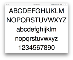
I first saw this typeface spray painted through hand-cut stencils onto a 72 × 128" banner to announce the fall 2017 performance and lecture series at the Yale school of Art. Five months later, Nate Pyper emailed me IO as an OpenType font made using copies of only two units: a straight line and a curved line. “All the capital letters of the alphabet may be written using several basic strokes, straight and curved, common to each letter,” said Bruno Munari.
IO is available under the SIL Open Font License.
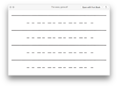
In 2001, Paul Chan wrote “The field that fonts play in is expansive and intimate. It is loaded into your computer on a systems level, so any application that uses fonts can play. Word processing applications become linguistic desiring machines; database software becomes a De Sadean regulator of philosophical pie charts and perverse graphs.” Chan had recently begun his Alternumerics project, in which he produced and distributed font artworks for free download through his website National Philistine (now offline but still accessible through the Wayback Machine). Among these fonts were tributes to Charles Fourier, Stéphane Mallarmé, and the Black Panther Party, as well as his own self portraits and dream diagrams. The two fonts included here, 2005’s The river, gone and The wave, gone, are Chan’s eulogies to the painter Agnes Martin, who passed away the year prior. They assign the same glyph to every keystroke, generate compositions of overlapping, horizontal lines and not-quite-straight dashes.
These fonts have been converted to OTFs from their original SUIT format.
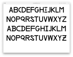
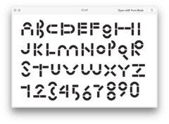
David Bennewith has done significant research into a series of typographic studies conducted by the MIT Lincoln Laboratory, who in the 1950s were commissioned by the US Navy and Air Force to produce a computer network for early warning air defense. This development would eventually lead to the Semi Automatic Ground Environment (SAGE) computer network, which relied on a control system of cathode ray tube and dot-matrix digital displays for soldiers to track targets. Years of typographic experiments were needed to find concise, instantly-recognizable letterforms for these types of monitors—e.g. forms that would clearly distinguish “I” from “1” or “L,” or “0” from “O.” Bennewith has translated four of the MIT Lincoln Laboratory’s experiments into free, OpenType fonts. What twenty-first century designers should design with such military-funded typographic forms is an open question.
Lincoln/MITRE is available under the SIL Open Font License.
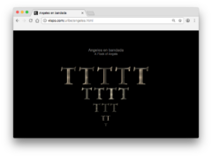
Ana Maria Uribe (1951–2004) was a poet whose visual work extends back to the late 1960s. From 1997 to 2001 she produced “anipoems” to be viewed in a web browser. Many of these are still online today thanks to the visual/animated poetry archive Vispo. The component parts I’ve included here—four animated GIFs and an SWF—are not to be understood as independent works, but are to be combined in a browser to produce Uribe’s 1997 poem “Angeles en bandana (A Flock of Angels).” The poem arranges fifteen Garamond “T” glyphs in the form of an upside down triangle and animates them with out-of-sync bevels and inner glows. While this animation loops, so does a short piece of metallic-sounding audio titled “humhum.swf.” May we all, at some point in our lives, stare at an individual letterform long enough to recognize in it the shapes of our own mythologies.
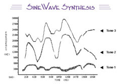
Haskins Laboratories is a New Haven-based, non-profit research institute that specializes in “the science of the spoken and written word.” I first visited them in early 2017 to spend time in their anechoic chamber and have since frequented haskinslabs.org, where I draw inspiration from their impressive collection of images, audio files, and texts. One section of the site is dedicated to the Haskins SineWave Synthesizer (SWS), a program developed by Philip Rubin in the 1970s, which synthesizes speech using three rapidly changing tones. For most listeners, these three tones are sufficient to convey a phonetic message. To demonstrate the effectiveness of the SWS, Haskins Laboratories has published nine sample AIFFs, as well as their corresponding source material and input diagrams. For your convenience, I have edited these audio files together into a gapless MP3 that repeats its entire sequence three times. The audio contains synthesized recitations of the following sentences:
1. “Where were you a year ago?”
2. “My dog Bingo ran around a wall.”
3. “I read a book today.”
4. “Kick the ball straight and follow through.”
5. “Rice is often served in round bowls.”
6. “My TV has a twelve-inch screen.”
7. “Please say what this word is.”
8. “The beauty of the view stunned the young boy.”
9. “The steady drip is worse than a drenching rain.”
When I type, sometimes, writing to somebody I’m not too interested in (or don’t have much to communicate to although I owe this person an email), I get some phrase that stays in my head a few seconds until it hazes to something as hard to recall as a dream. It may be the string “bbbbbbbbbbbb” that I press into my keyboard and stare through before I delete it from my screen and my brain. I can’t say whether the sound or the image of the string comes first; they seem to occur simultaneously and disappear in much the same way. And I can’t say with surety that the way the string looks influences how I pronounce it in my head. This sequence can loop for minutes before I remember where I am in my workflow and in my schedule. I raise my face out of the white text entry field into a desk space surrounded by printed paper and hand-written notes. And grinning like a tiger!